Why AI developers should use confidence intervals, not standard errors, for error bars
And a proposal for a better way to visualize AI evaluation uncertainty: gradient plots.

Look at this chart comparing AI model performance. What conclusion do you draw?
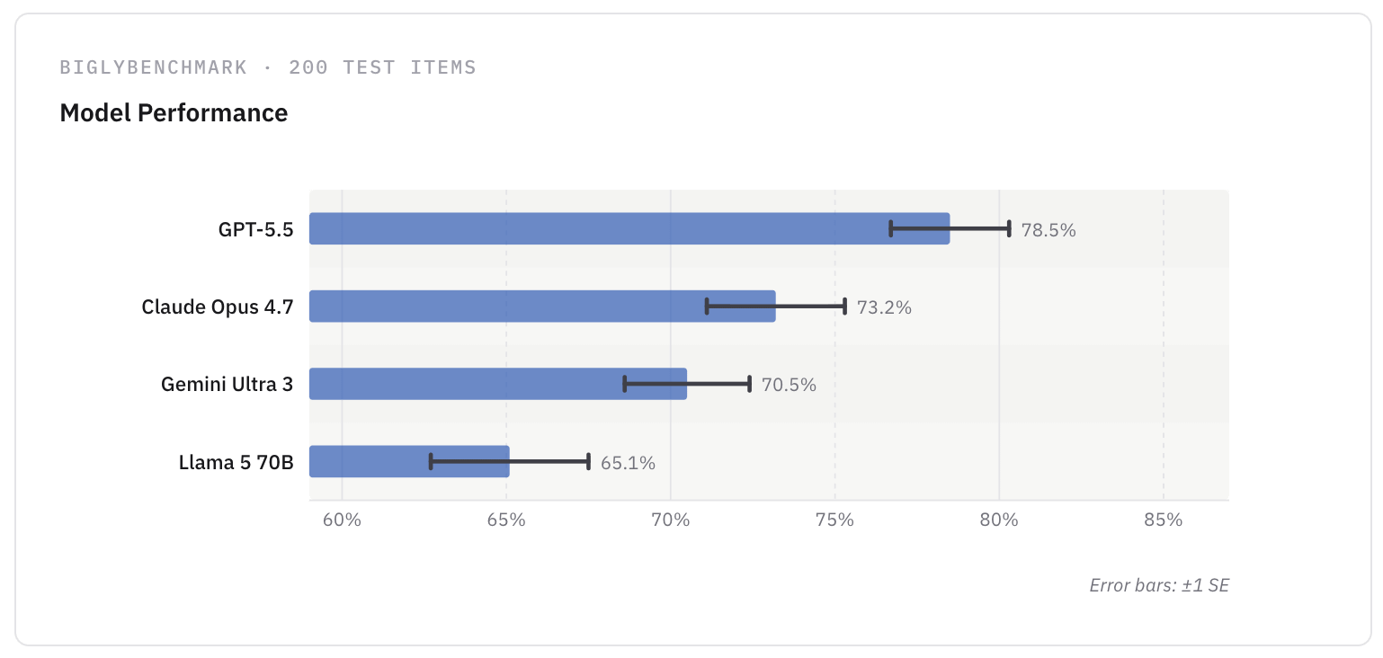
You might conclude that GPT-5.5 is the clear winner, since its error bar doesn’t overlap the others.
Yet that intuition is not accurate. Why?
How standard errors mislead when used as error bars
The error bars in the chart show standard errors (SEs), specifically ±1 SE—a mapping which is incredibly common when AI labs report benchmark results. But there’s a serious problem with this mapping.
Standard errors do not directly indicate the range where the “true” value might lie—they instead describe how much the sample mean would vary across repeated experiments. In other words, SE communicates the jitteriness (standard deviation) of your sampling, were you to repeat the experiment many times.
This is scientifically proven to lead viewers to be overconfident: an error bar that plots ±1 SE is only about 68% confident to capture the true value, yet people interpret it as nearly 100%. Imagine if Anthropic said "we are 68% sure Claude Mythos Preview won’t generate code that infects your system with malware”—people would be alarmed. Yet, when we see non-overlapping error bars, we visually treat them as if we are basically 100% certain of a difference.
That means that whenever you see an “standard error” error bar, you should approximately double the width1 if you want to visually compare performance in terms of certainty. When we perform that adjustment on our example above, a clear overlap appears:
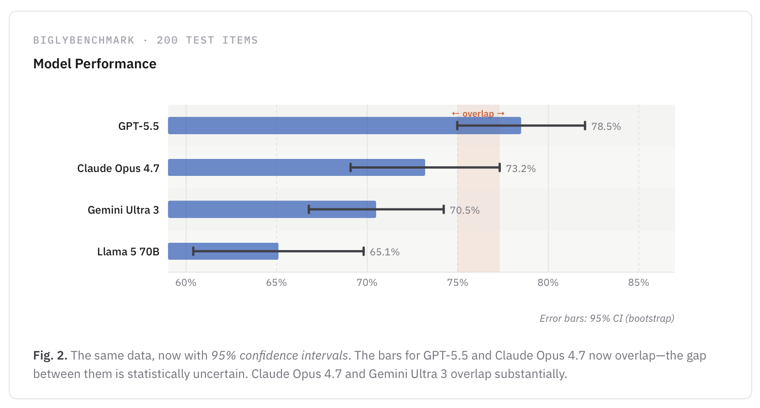
This adjusted bar is called a 95% confidence interval (CI). By contrast to standard errors, confidence intervals do provide an interval that is designed to contain the true population parameter with a specified level of probability—here 95%.2 Another nice thing about CIs is that their visual interpretation doesn’t depend on the data following a normal distribution, but rather the calibration of the method used to compute them, which we can verify with simulations on evals-like data.
So when AI labs plot ±1 SE instead of a 95% confidence interval in their error bars, they are visually shrinking model uncertainty by about half. This can make the performance between two AI models look significantly different, when there might actually be a significant overlap.
Confidence intervals (and their Bayesian equivalents, credible intervals) are the recommended method by scientists when reporting uncertainty of point estimates. They also are known to lead to better-calibrated decision-making and data inference. To be clear, standard errors should be reported too, but they can lead people to be misleadingly overconfident when plotted as error bars—which definitely matters in the high-stakes, noisy world of AI evaluation.
But what if we’re visualizing uncertainty wrong entirely? What if error bars themselves are the problem?
Good question. So, let’s not stop there.
Confidence intervals are the best estimate we have of uncertainty, and reporting them is critical. I think this is as much as we can ask current developers.
However, it’s valid to question the entire enterprise of plotting a [—x—] style error bar at all. There is known evidence that, though CI-based error bars lead to lower false positives compared to standard errors, the discrete way we visualize these errors, especially on bar charts, can mislead. And, discrete bars can also lead to perceptual distortions when estimating statistical significance (empirically, two “just-touching” 95% CI error bars actually indicate a p-value of about .006—the difference is extremely unlikely to occur by chance, <1%, not just <5%).3
That begs the question:
Should we change our plots, too?
That is the argument of “Error Bars Considered Harmful…”, Correll and Gleicher (2014), a classic study in data visualization. They argue that error bars on bar charts suffer from:
• Within-the-bar bias: the glyph of a bar provides a false metaphor of containment, where values within the bar are seen as likelier than values outside the bar.
• Binary interpretation (the “cliff effect”): viewers adopt black/white thinking that either values are within the margins of error, or they are not. This makes it difficult for viewers to confidently make detailed inferences about outcomes, and also makes viewers overestimate effect sizes in comparisons.
They show through a series of experiments that gradient plots—where the 95% CI region is shown as a solid block of color and opacity decays continuously beyond it—lead to more accurate inference by humans:
A follow-up study shows similar performance.4
Now, we cannot adapt their approach directly to AI evals because the original paper derived the gradient fall-off from a t-distribution—an approach that assumes normality and works best in a large-sample data regime. Neither assumption holds in AI evals-like data scenarios, generally speaking.
However, we can make a reasonable adaptation of this plot—and one that that makes no assumptions about the distribution and uncertainty method.
The basic idea is this: In addition to the 95% CIs, we might compute 99% and 99.9% CIs using the same method used for the 95% CI. (These intervals will be wider.) Then, while the 95% CI could appear fully opaque, opacity might decrease linearly: 20% opacity at the 99% CI boundary, say, and 2% opacity at 99.9%, like so:
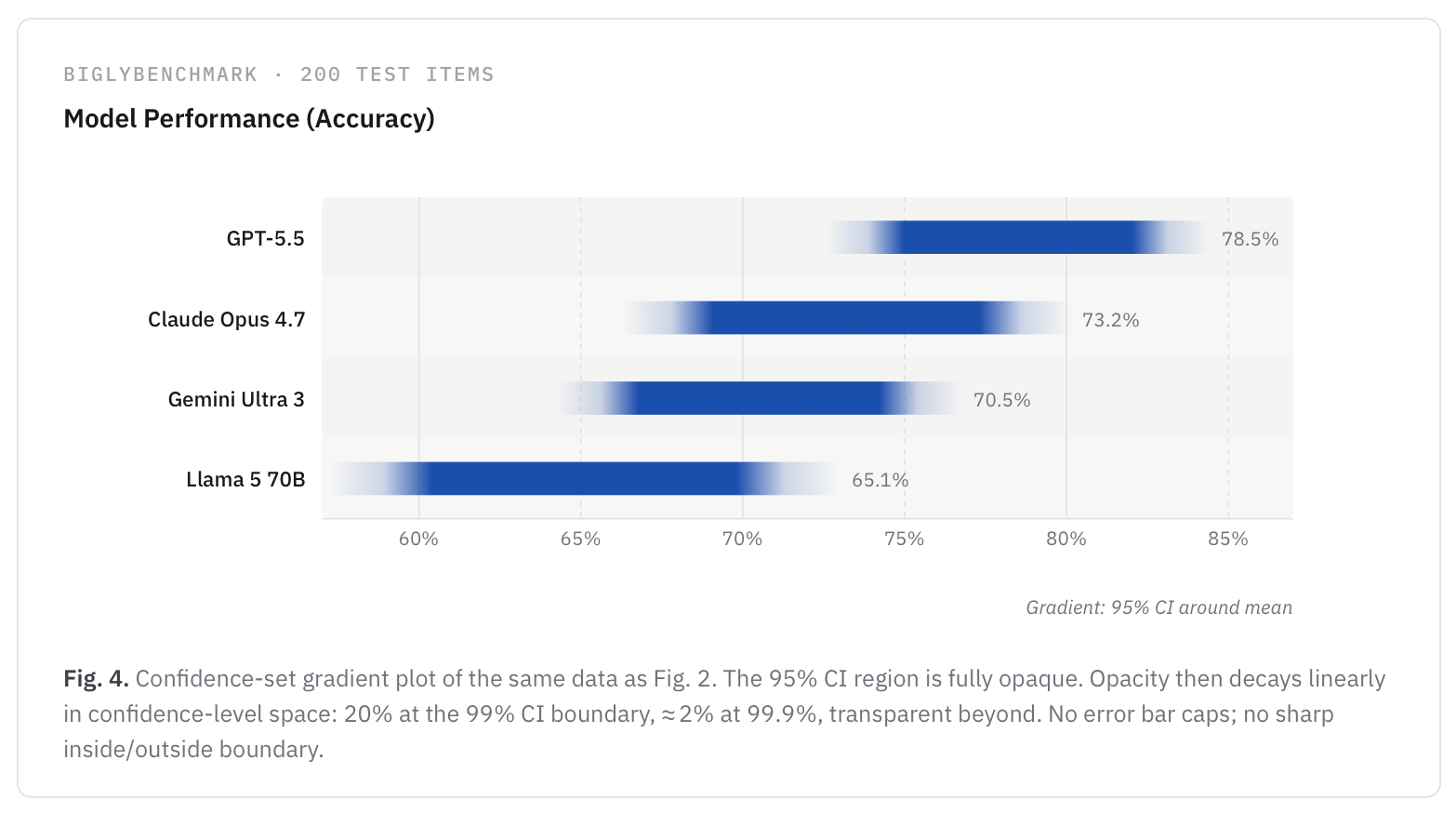
What’s nice about this “smudge plot” is that it communicates 99% and 99.9% CIs as well, while avoiding the “binary interpretation” that discrete error bars suffer from.5
I’m thinking of making these smudge plots the default in evalstats, since I think they’re the best approach to communicate uncertainty in AI evals in a compressed space—if you’re going to show a visual anyway, you might as well spend a few more milliseconds computing extra CIs. They’re also close enough in appearance to bar charts and CI line-plots that I don’t think there’s a learning curve to reading them.6
Conclusion
TLDR: When showing uncertainty in AI evaluations, developers and practitioners should default to 95% confidence intervals for error bars, and always label the bars. Also, it would be better to use a gradient plot (or violin plots) instead of a bar chart to more honestly convey uncertainty of the estimate, to mitigate “binary” all-or-nothing thinking. To be clear, 95% CIs as error bars are not entirely free of issues, either, but they are way better calibrated, more honest, and safer than the status quo.
So… what is this in reaction to, anyway? Are frontier AI labs really plotting error bars using standard errors?
Yes, essentially—that is, when their plots include error bars at all.
In the past month, I’ve been seeing more error bars on my social media feed from developers. Anthropic seems to have remembered them. DeepMind reports results of their multi-agent math system with Accuracy ± standard errors. But in almost all cases, these error bars report standard errors, not confidence intervals.
Now, plotting any error bars at all is a big improvement in the wild west of AI evaluation, where raw means are often reported without any uncertainty estimates. Even among AI research, only 16% of 445 benchmark papers conducted any statistical tests, let alone the right ones. So, seeing error bars is something to celebrate.
However, as we just showed, standard errors mislead viewers by encouraging them to draw overconfident conclusions. And in most cases, the error bars don’t even have a clear label. For instance, ScaleAI reports their means ± something, i.e. without labels, and the full leaderboard labels them only a “range.” Anthropic labels recent benchmark results with “Error bars computed by bootstrap sampling within problems,” without clarifying exactly what was computed. (A clustered standard error—or a confidence interval? And if the latter, at what confidence level?) Similarly, EpochAI’s interactive widget labels error bars as standard errors, but only in two views of the data.
In fact, the only report I’ve stumbled across that used 95% CIs as error bars was by METR, “Task-Completion Time Horizons of Frontier AI Models.” You can see very light error bars and hovering over a point shows the 95% CI, clearly labeled:
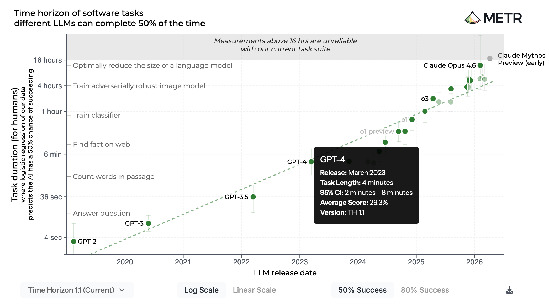
Kudos to METR for doing what frontier AI companies don’t seem to be able to. However, the error bars here are so light as to be almost imperceptible—gradient plots (or “smudge plots,” if you’d like) could avoid these issues.
Final word
Here, I’ve made a reasonable proposal to AI developers on what they should use when plotting errors bars in model evaluation results. However, this is not the end of the story: I’ve deliberately avoided talking about further complexity, like family-wise error rates and simultaneous CIs, pairwise comparisons, this study, debates over frequentist vs. Bayesian methods, or the substantial later research on uncertainty in data visualization by researchers like Jessica Hullman, Matthew Kay, and Lace Padilla. If you’re interested in hearing about that and more in a future post, subscribe.
~Ian Arawjo
If this post helped you, drop me a line (or, if you’re so inclined, you might buy me a caffeinated beverage to fuel more writing like this). As an academic, our “currency” is street cred—so, if this post influenced how your company reports AI evaluation results, let me know.
Bio
I’m a researcher and software engineer focused on AI evaluation and human-computer interaction (HCI), who is on a mission to improve statistics in AI evaluations (see the working guide at statsforevals.com and the corresponding Python package, evalstats). In the past, I've conducted research in LLM evaluation, creating tools like ChainForge and EvalGen that influenced on the design of evals platforms and pipelines, including at LangSmith, Chroma, and Weights & Biases. In my day job, I'm an Assistant Professor in the Department of Computer Science and Operations Research (DIRO) at Université de Montréal, where I teach a graduate-level empirical methods course in HCI, including statistical analysis of experiment data with methods like mixed effects models.
One standard equation to estimate a 95% CI is ± 1.96×SE. This assumes normality—for large-scale benchmark results that can take advantage of the Central Limit Theorem (CLT), it’s largely accurate. However, the SE is a poor estimate of the CI when sample sizes are small (n<30), data is not normally distributed, or non-parametric methods are used—essentially, all common situations that developers can face in AI evaluations.
Eagle-eyed statisticians would argue the 95% confidence interval technically “does not imply a 95% probability that the true parameter lies within a particular calculated interval, which is instead associated with the credible interval in Bayesian inference. The confidence level instead reflects the long-run reliability of the method used to generate the interval… In other words, if the same sampling procedure were repeated 100 times from the same population, approximately 95 of the resulting intervals would be expected to contain the true population mean” (Wikipedia). In practice, however, this pedantic distinction is largely irrelevant for practical decision-making. And for large datasets, frequentist confidence intervals and Bayesian credible intervals typically converge on the same numbers. Because evalstats blends both approaches under the hood and empirically verifies its choices for recommended CI methods via simulations in small-sample data regimes, the line between these two methodologies is even more blurred. For simplicity and consistency, we refer to them colloquially as confidence intervals, and technically could claim a Bayesian method is used to “estimate” the CI via simulations—which is the argument used in Bowyer et al. (ICML 2025)—but still, the theoretical difference is worth noting.
Arguably, this slight perceptual conservatism is warranted in AI evals settings, as benchmarks are almost always noisy estimates of underlying performance due to impaired construct validity. Still, it’s confusing, and it means that slightly overlapping intervals can be statistically significant at p<0.05"—not to mention the additional problem of pairwise comparisons, which I talk about in a working tutorial on comparing prompt performance.
The studies mentioned here also test violin plots, showing they perform equally well to gradient plots. So, AI practitioners could also use violin plots. Personally, I like the simplicity of the gradient plot. But there’s also design reasons to prefer gradient plots: 1) gradient plots can be more easily be plotted in the terminal—important when you’re making a terminal CLI; and 2) gradient plots are easier to compress and present many simultaneously, whereas violin plots require more screen real-estate.
Technically we could estimate the entire confidence distribution (CD) and plot its density, but I’m not getting into that here.
However, it would be nice to know how to adjust the gradient to avoid the extra “conservatism” during comparative interpretation implied by Belia et al. (2005). Perhaps computing a 90% CI, and then falling off from there, would be the best calibrated approach.